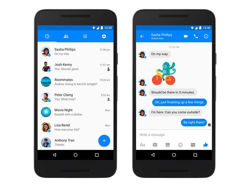
Facebook’s standalone Messenger app is finally receiving a Material Design makeover. The news was confirmed by Messenger’s Lead David Marcus in Facebook and Twitter posts.
The all new Material Design will be rolling out starting Monday to Android users. Talking about the new design, Marcus said, “Any major redesign of an essential app used by hundreds of millions of people around the world is painstakingly hard, and that’s why we took every precaution to ensure you’d truly enjoy this evolution.”
The Messenger app’s Material Design user interface revamp, is still rolling before the main Facebook app. Google had introduced the Material Design philosophy alongside Android Lollipop in 2014.
Some of the Material Design changes in the Messenger app include new icons and animations. After the update, users can notice a new floating button for starting new chats. Previously, users had to press a button seen on the bottom tab to start a new chat. Facebook’s Messenger app was announced to shot past 800 million this January and has been since receiving new features.
Last month, Facebook redesigned its Messenger app and added multiple account support so that more people can use it on the same smartphone or tablet. The update was initially available on devices running on Android, which is world’s most popular mobile operating system.
Last week, Messenger received Spotify integration which will allow users to quickly jump to Spotify by tapping the three-dot menu button inside Facebook’s Messenger and from there they can easily share a song or a playlist with their friends on Messenger.
[“source-ndtv”]


