Hotstar and Netflix are competing with each other – and Amazon’s Prime Video – for a lead in the online content streaming market in India, and a recent development might make it harder for you to differentiate between the two.
Hotstar recently updated its interface to something very similar to what Netflix offers. The updated interface, which recently debuted on Amazon Fire TV Stick, features a giant show preview that has links to all the episodes and trailers of the selected show. There is also an episode listing with thumbnails, titles, and synopsis of different episodes. All the seasons are also available on the episode listing to let viewers easily move from one season to another.
Among other similarities, Hotstar on Amazon Fire TV Stick offers a show preview once you select any of the shows from the catalogue. This preview screen has the synopsis of the show at the left side. There are also the links to the latest episode, seasons, and previous episodes below the synopsis. Below the episode links, there are the links to Extra clips, if any. There is also the poster of the episode at the right side.

Show preview on Hotstar

Show preview on Netflix
As is evident from the images above, the experience on Netflix is identical as there is the poster of the episode on the right, while the synopsis and episode links are available on the left. There is also a ratings icon that aren’t a part of the Hotstar interface, though.
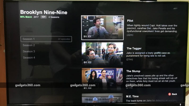
Apart from the show preview screen, the episode listing on the updated Hotstar looks similar to the episode listing on Netflix. There are thumbnails showing the glimpse of the episodes at the right, along with the title of the episode and the synopsis. Viewers can also switch to other seasons or episodes from the episode listing.

Episode listing on Hotstar

Episode listing on Netflix
There’s no word on whether the same UI will be coming to Hotstar on other platforms, but we wouldn’t be surprised if that’s the case.
You can download the updated Hotstar app for your Amazon Fire TV Stick by visiting Amazon Appstore.


