We were afraid that Nokia’s glory days were well and truly over, when it announced the sale of its entire handset business to Microsoft. The Finnish giant defined generations of mobile devices, especially in India. As we moved from basic bricks that made only voice calls to smartphones with cameras and Internet connections, chances are we all owned a number of Nokias along the way.
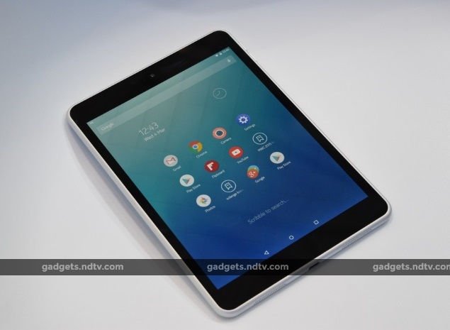
As it turns out, we might not have to wait much longer to own a Nokia product again. Even though it struggled for years and then made a string of poor decisions leading to the sellout to Microsoft, Nokia has now demonstrated that it has no intention of getting out of the consumer product space and letting its brand die. Licensing terms might not allow it to sell smartphones for some time, and so we have the remarkable new N1 tablet leading the charge.
Nokia is showing off the N1 at its booth at the Mobile World Congress, currently under way in Barcelona. The N1 is already shipping in China, but Nokia won’t say anything about when it might launch anywhere else other than the fact that it is committed to launching it in Europe next. It costs the equivalent of $249 (roughly Rs. 15,500) and, says the company, it is highly in demand.
It feels as though a part of Nokia has always wanted to release this tablet. Judging by its fit and finish, it seems to have been in development for a long time. Foxconn is the manufacturing partner and it should be no surprise that there is an Apple-level air of quality to it. The whole thing is made from a single block of aluminium and there are no seams or joints.
In terms of looks, the Nokia N1 is most like a first-generation iPhone, with rounded edges and corners but flat on both sides. It’s available in two colours, Lava Grey and Natural Aluminium. The finish is anodized so it offers a grip but still feels smooth. There are no slots or panels for SIM and microSD cards – the N1 is Wi-Fi only and its storage cannot be expanded. At 6.9mm thickness and a weight of 318 grams, this is a very portable, yet physically strong tablet.
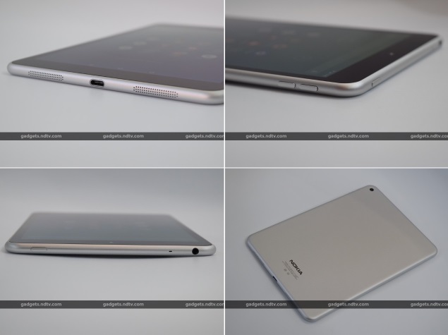
The buttons on the sides, camera in one corner of the rear and even the positioning of ports and speakers feel strongly inspired by Apple, yet also complement the designs of phones such as the Nokia N9. In fact there are a lot of Apple-inspired touches even beyond the design. Nokia is clearly positioning the N1 as an inexpensive alternative to the iPad mini 2.
Fascinatingly, Nokia uses the USB Type-C connector for charging and data. This is the first example we’ve seen of a shipping product with the new, reversible standard. Nokia has styled the port on the bottom of the N1 to look just like one of Apple’s Lightning ports. Interestingly, only USB 2.0 speeds are supported, whereas most Type-C implementations will support USB 3.1 speeds when the standard becomes widespread.
The tablet is powered by a 2.3GHz Intel Atom Z3580 processor and has 2GB of RAM. Only a 32GB storage configuration is available, and so we hope that larger capacities are planned for when the N1 launches in other parts of the world.
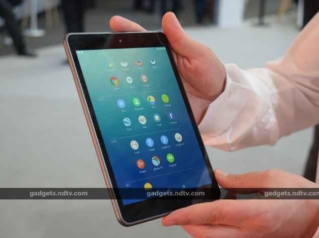
The screen has exactly the same size and resolution as the iPad mini 2: 7.9 inches diagonally and 1536×2048 pixels. The panel is laminated onto Gorilla Glass 3, which means there is no air gap and everything looks rich and crisp.
Wi-Fi b/g/n/ac and Blutooth 4.0 are supported. There’s a 5300mAh battery for power. The rear camera has a resolution of 8 megapixels and supports 1080p video recording, while the front camera is 5 megapixels. There is no flash.
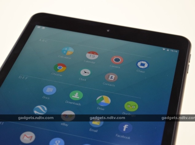
The other big story is the Nokia Z Launcher, which runs on top of Android 5.0. This is the company’s main attempt at differentiation. First of all, it looks fantastic. Text is crisp, colours are muted yet elegant, and everything is smooth and responsive.
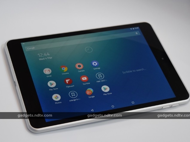 By default you see a grid of 12 icons, but can swipe left to pull up an alphabetised grid of all app icons. The homepage grid refreshes itself periodically and learns your habits, so for example the options displayed around the time of your morning commute will not be the same as the ones shown later in the day.
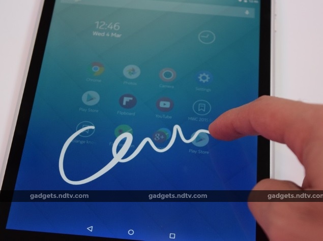
You can also simply scribble letters on any part of the screen to start searching for apps – this is incredibly fluid and is much quicker than tapping in a search field and then tapping letters. In fact it’s like having a keyboard permanently available for quick shortcuts.
 Anyone who doesn’t like Z Launcher can switch to stock Android, and anyone who absolutely loves it can also download it for their Android phone. Nokia hopes people will come to see the N1’s hardware and software as unified.
We think the N1, despite its unoriginal design touches, is a fantastic tablet. We look forward to testing its screen, performance, cameras, and more in more suitable conditions when it is launched in India. We don’t know any dates but it is coming at some point – Nokia reps made a point of telling us that they are aware of the brand’s power in India and have no intention of letting it slide into obscurity.
Disclosure: Nokia was showcasing its products at MWC 2015 in Barcelona. Qualcomm sponsored the correspondent’s flights and hotel for Barcelona.

