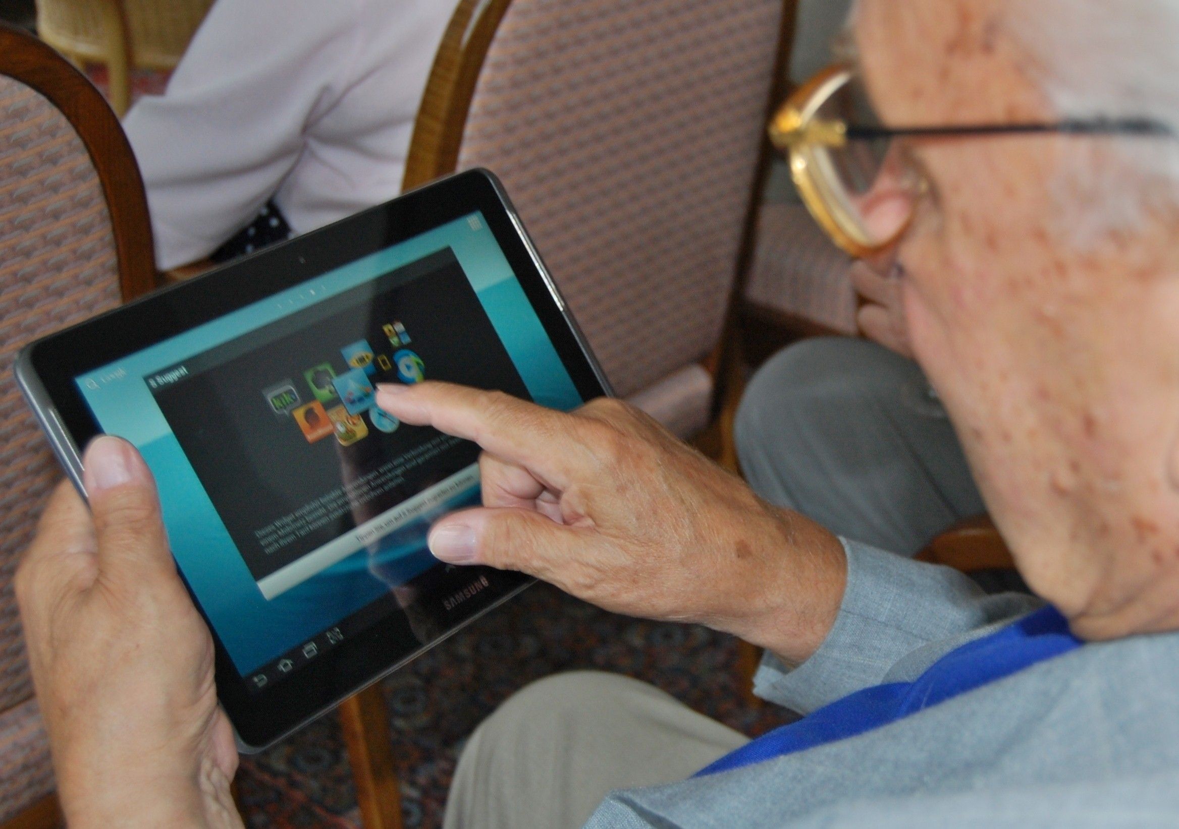
It has become an industry standard to put “mobile first” when designing for the mobile web and while this is, in general, a good thing – it has also left to a neglect of the tablet platform in mobile design. There are clear differences between smartphones and tablets and key differences in the way that users interact with them. It’s important for us – as UX designers – to understand these differences so that our designs can satisfy both sets of users.
The smartphone tends to dominate discussions of the mobile internet and there’s no major surprises about that. Figures released this year show that smartphones not only dominate the market but are continuing to grow (in terms of market penetration) at about 13% a quarter. The humble tablet, on the other hand, seems to have reached peak market penetration and is expected to decline in sales from this point forwards according to figures from IDC, the data analysts.
However, as TechCrunch notes much of the fall in tablet sales can be found in new sales for Phablets – the larger smartphones which are almost (but not quite) the size of a tablet. This means that, for the moment at least, as designers, we still need to consider tablets and phablets as well as smartphones in our design efforts.
Contents
Key Usage Differences
Smartphones tend to be the preferred platform for users aged between 18 and 34 but for those older or younger than that market sector; the tablet is the dominant platform according to Flurry analytics. This may be because the tablet makes for an easier transition from the laptop/desktop market for older users and is more convenient in terms of screen real estate for younger users (who are also less likely to be “always on the go” or have less access to a smartphone than the 18-34 year old market).

In general smartphones and tablets get about equal use across the course of the day but in the evenings, again according to Flurry, there is a distinct peak of tablet use over smartphone use. This can easily be explained as these are the times people are most likely to be at home and able to use a larger device over a smaller one.
The biggest difference in usage patterns is what each platform is used for. Smartphones are most often used for games (39%) then social networking (24%) and utilities (17%) whereas tablets are most used for games (67%! Almost twice as much as phones), social networking (10% less than half the equivalent phone usage) and entertainment (9% which is three times as much as a phone user and utilities barely get a look in with just 4% of tablet usage)
It’s also interesting to note that while smartphones are used far more frequently across the course of the week (roughly 13 times to 9.5 tablet uses) they are used for much less time with the average session length at just over 4 minutes (compared to 8.2 minutes on a tablet).
That means that designers need to consider what tablet users want when compared to smartphone users and focus on the differences if they want to win over the tablet user.
Key UX Considerations for Smartphones and Tablet
There are some clear differentiators between the two platforms and these need to be considered carefully when designing user experiences.
The Smartphone
Smartphones are:
-
More mobile than tablets and more likely to be used in wide variety of locations and scenarios
-
More likely to suffer from distracted use (because of their mobility)
-
Generally of lower (or at least smaller) resolution than tablets
-
Rarely the primary access point for users to the internet (though in developing nations they may be)
-
Likely to be used for multi-tasking (users flit from app to app rather than spending significant times doing any particular task)
-
More personal and thus more likely to be used for social and emotional contexts
-
Less likely to have controlled lighting available when in use

The Tablet
Tablets are:
-
Less mobile, they’re too big to be user friendly in all spaces (though we’ve noticed this doesn’t stop people from trying nonetheless)
-
More likely to be used in a fixed position (at home, in the office, in a café)
-
More likely to be used by more than one user and are thus less personal and emotional platforms
-
More likely to provide higher resolution (or at least bigger) experiences than a smartphone
Both tablets and smartphones require “fat finger friendly” design in that 44 pixel targets are a minimum for buttons, icons, etc.

The Take Away
The tablet user experience is different from the smartphone user experience. A “one size fits all” mobile design policy is likely to leave one platform or the other poorly catered for. Mobile first may be a good starting point for some, for others “tablet first” may be a greater priority and this is particularly true for games and entertainment product designers.
It has become an industry standard to put “mobile first” when designing for the mobile web and while this is, in general, a good thing – it has also left to a neglect of the tablet platform in mobile design. There are clear differences between smartphones and tablets and key differences in the way that users interact with them. It’s important for us – as UX designers – to understand these differences so that our designs can satisfy both sets of users.
The smartphone tends to dominate discussions of the mobile internet and there’s no major surprises about that. Figures released this year show that smartphones not only dominate the market but are continuing to grow (in terms of market penetration) at about 13% a quarter. The humble tablet, on the other hand, seems to have reached peak market penetration and is expected to decline in sales from this point forwards according to figures from IDC, the data analysts.
However, as TechCrunch notes much of the fall in tablet sales can be found in new sales for Phablets – the larger smartphones which are almost (but not quite) the size of a tablet. This means that, for the moment at least, as designers, we still need to consider tablets and phablets as well as smartphones in our design efforts.
Key Usage Differences
Smartphones tend to be the preferred platform for users aged between 18 and 34 but for those older or younger than that market sector; the tablet is the dominant platform according to Flurry analytics. This may be because the tablet makes for an easier transition from the laptop/desktop market for older users and is more convenient in terms of screen real estate for younger users (who are also less likely to be “always on the go” or have less access to a smartphone than the 18-34 year old market).

In general smartphones and tablets get about equal use across the course of the day but in the evenings, again according to Flurry, there is a distinct peak of tablet use over smartphone use. This can easily be explained as these are the times people are most likely to be at home and able to use a larger device over a smaller one.
The biggest difference in usage patterns is what each platform is used for. Smartphones are most often used for games (39%) then social networking (24%) and utilities (17%) whereas tablets are most used for games (67%! Almost twice as much as phones), social networking (10% less than half the equivalent phone usage) and entertainment (9% which is three times as much as a phone user and utilities barely get a look in with just 4% of tablet usage)
It’s also interesting to note that while smartphones are used far more frequently across the course of the week (roughly 13 times to 9.5 tablet uses) they are used for much less time with the average session length at just over 4 minutes (compared to 8.2 minutes on a tablet).
That means that designers need to consider what tablet users want when compared to smartphone users and focus on the differences if they want to win over the tablet user.
Key UX Considerations for Smartphones and Tablet
There are some clear differentiators between the two platforms and these need to be considered carefully when designing user experiences.
The Smartphone
Smartphones are:
-
More mobile than tablets and more likely to be used in wide variety of locations and scenarios
-
More likely to suffer from distracted use (because of their mobility)
-
Generally of lower (or at least smaller) resolution than tablets
-
Rarely the primary access point for users to the internet (though in developing nations they may be)
-
Likely to be used for multi-tasking (users flit from app to app rather than spending significant times doing any particular task)
-
More personal and thus more likely to be used for social and emotional contexts
-
Less likely to have controlled lighting available when in use

The Tablet
Tablets are:
-
Less mobile, they’re too big to be user friendly in all spaces (though we’ve noticed this doesn’t stop people from trying nonetheless)
-
More likely to be used in a fixed position (at home, in the office, in a café)
-
More likely to be used by more than one user and are thus less personal and emotional platforms
-
More likely to provide higher resolution (or at least bigger) experiences than a smartphone
Both tablets and smartphones require “fat finger friendly” design in that 44 pixel targets are a minimum for buttons, icons, etc.

The Take Away
The tablet user experience is different from the smartphone user experience. A “one size fits all” mobile design policy is likely to leave one platform or the other poorly catered for. Mobile first may be a good starting point for some, for others “tablet first” may be a greater priority and this is particularly true for games and entertainment product designers.
[“source=interaction-design”]


